Sorry for the late response, Taunya. I am somewhat saturating the colors and slightly increasing the contrast on most of my photos. This is pretty standard practice from what I've read in order to make them "pop" a bit more on the screen. Most cameras by default use saturation and contrast values that produce images appropriate for prints rather than viewing on a monitors, and thus it seems like a reasonable decision to merely alter those values for this contex. Also, it makes them look way better.


4 comments:
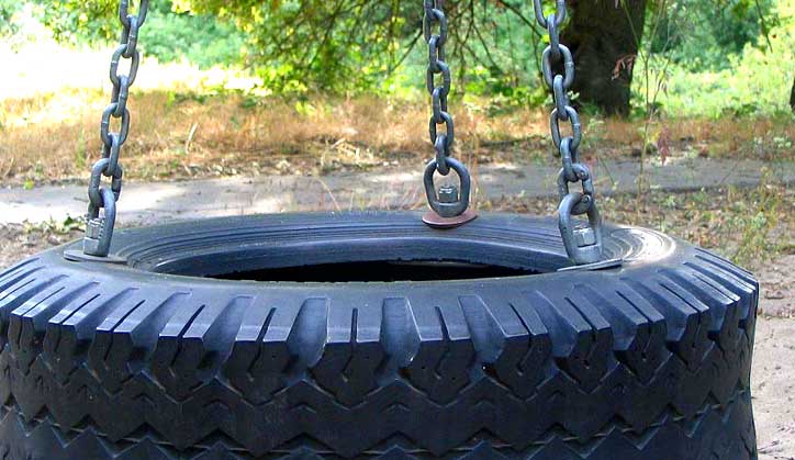
really like the top one. similar in scope to your previous photo of the stairs. great color palette and feeling of immersion.
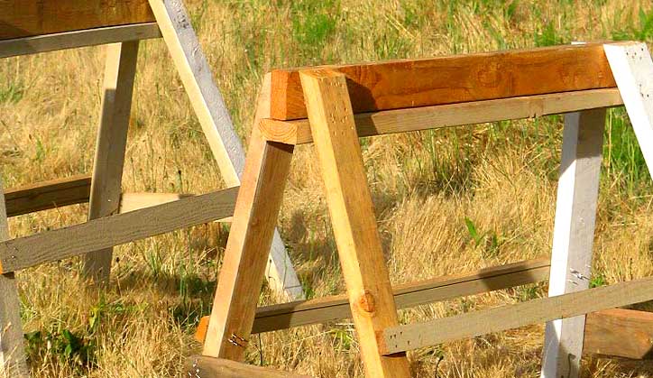
Thanks and LOL about the sawhorses.
Your camera seems unusually good at picking up warm and cool colors equally well. Or are you color correcting them?
/taunya
Sorry for the late response, Taunya. I am somewhat saturating the colors and slightly increasing the contrast on most of my photos. This is pretty standard practice from what I've read in order to make them "pop" a bit more on the screen. Most cameras by default use saturation and contrast values that produce images appropriate for prints rather than viewing on a monitors, and thus it seems like a reasonable decision to merely alter those values for this contex. Also, it makes them look way better.
Post a Comment